30 Days of Maps Day 9 - AI Only

We're onto day 9 of the #30DayMapChallenge.
The theme for today's map is AI Only - This day is all about prompt engineering. Use AI tools like DALL-E, MidJourney, Stable Diffusion, or ChatGPT with geospatial capabilities to create a map based on AI-generated content. The challenge is to get the right prompt and critically assess the output—how well does AI capture or distort the map's intent?
I thought I would explore a scenario where you're working in a development environment with sensitive customer data but need substantial dummy data to test your reports. Using real customer data can be fraught with legal and privacy issues, especially in industries like finance, healthcare, and retail. That's where synthetic data comes in handy. Luckily, at Tekantis, we're already actively exploring synthetic data generation using OpenAI as part of one of our sideline lab projects. We have developed a Synthetic Data Generator Custom GTP to help create realistic but fake datasets. I have leveraged this tool to generate synthetic customer data with geospatial attributes to test map visualisation in Power BI.
The Business Scenario
Imagine you work in a company that handles customer data for market analysis. You need to create visual reports, but you can't use actual customer data because of privacy policies. Instead, I generated a dataset of 20,000 synthetic customer records, including attributes like customer names, age, gender, occupations, phone numbers, and coordinates within London. To make the data more realistic, we clustered customers around specific areas of London, mimicking natural customer distributions.
The Result
So how did we do it?
The Synthetic Data Generator Custom GTP
The Synthetic Data Generator Custom GTP is designed to act as a multi-step process, working with the user interactively. First, it clarifies each requirement before moving on to the next step, ensuring accuracy and alignment with user expectations. Then, it uses the code interpreter to generate and execute Python code in real-time. Once the data is successfully generated, it provides a downloadable link for easy access to the resulting file.
The first step is for the AI and User to agree the plan, the GTP does most of the work here I simply prompted with the above scenario and after a couple of iterations the GTP had generated the following plan:
-
Bounding Box over London: Use a simple square bounding box covering London to generate random latitude and longitude coordinates, simplifying the location generation process.
-
Attributes to Include: Generate a dataset of 20,000 customer records with the following attributes:
- Customer ID: Unique identifier for each customer.
- Name: Generated using gender-specific names from Faker.
- Gender: Evenly split between male, female, and a small percentage for other categories.
- Age: Distributed between 18 and 80 years, with more concentration in the 25-55 range.
- Occupation: Realistic job titles generated by Faker.
- Income: Random annual income between £20,000 and £100,000.
- Phone Number: UK-based phone numbers.
- Latitude and Longitude: Randomly generated coordinates within London.
- Life Time Value (LTV): A randomised total sales figure for each customer.
-
Clustering Data: Create clusters of customer locations to simulate areas with higher customer density:
- Defined five cluster centres across London: Central, North, East, West, and South.
- 80% of data points will be clustered around these centres.
- 20% will be uniformly distributed to simulate a spread-out population.
-
Data Generation Process:
- Generate clustered data points using normal distributions centred around each cluster centre.
- Generate uniform data points to cover the remainder of London.
- Generate demographic data (e.g., name, age, occupation) using the Faker library.
-
Validation:
- Ensure all latitude and longitude values fall within the bounding box.
- Verify that gender-specific names align correctly.
- Ensure age and income distributions are realistic.
-
Output: Generate a CSV file with all attributes included and provide a download link for easy access.
The second step is to generate and run the Python code, this is the code it produced which actually worked first time. However, even if it hadn't the beauty with the ChatGTP code interpreter is that it can identify and self-correct errors in the code, rerunning the script until it executes successfully:
import random
import pandas as pd
from faker import Faker
import numpy as np

# Initialize Faker
fake = Faker('en_GB')  # Use 'en_GB' locale for UK-specific data
Faker.seed(42)
random.seed(42)
np.random.seed(42)

# Parameters
num_records = 20000

# Define the bounding box over London (approximate coordinates)
min_lat, max_lat = 51.2868, 51.6919
min_lon, max_lon = -0.5103, 0.3340

# Cluster centers (latitude and longitude)
cluster_centers = [
    (51.5074, -0.1278),  # Central London
    (51.5555, -0.0786),  # North London
    (51.4860, -0.0200),  # East London
    (51.5121, -0.3007),  # West London
    (51.4400, -0.0550),  # South London
]

# Number of clusters and distribution of points
num_clusters = len(cluster_centers)
cluster_size = int(0.8 * num_records / num_clusters)
uniform_size = num_records - (cluster_size * num_clusters)

# Function to generate clustered points
def generate_clustered_points(center, num_points, cluster_std=0.02):
    lat_center, lon_center = center
    latitudes = np.random.normal(loc=lat_center, scale=cluster_std, size=num_points)
    longitudes = np.random.normal(loc=lon_center, scale=cluster_std, size=num_points)
    return latitudes, longitudes

# Generate clustered data
latitudes = []
longitudes = []
for center in cluster_centers:
    lat, lon = generate_clustered_points(center, cluster_size)
    latitudes.extend(lat)
    longitudes.extend(lon)

# Generate uniformly distributed data
uniform_latitudes = np.random.uniform(min_lat, max_lat, uniform_size)
uniform_longitudes = np.random.uniform(min_lon, max_lon, uniform_size)
latitudes.extend(uniform_latitudes)
longitudes.extend(uniform_longitudes)

# Truncate or extend lists to match num_records
latitudes = latitudes[:num_records]
longitudes = longitudes[:num_records]

# Generate demographic data
genders = np.random.choice(['Male', 'Female', 'Other'], size=num_records, p=[0.49, 0.49, 0.02])

names = []
ages = []
occupations = []
incomes = []
phone_numbers = []
customer_ids = []
lifetime_values = []

for i in range(num_records):
    gender = genders[i]
    if gender == 'Male':
        name = fake.name_male()
    elif gender == 'Female':
        name = fake.name_female()
    else:
        name = fake.name_nonbinary()
    names.append(name)

    # Age distribution (more customers in the 25-55 age range)
    age = int(np.random.normal(loc=40, scale=12))
    age = max(18, min(age, 80))  # Clamp age between 18 and 80
    ages.append(age)

    # Occupation
    occupation = fake.job()
    occupations.append(occupation)

    # Income level based on age (simplified assumption)
    income = random.randint(20000, 100000)
    incomes.append(income)

    # Phone number
    phone_number = fake.phone_number()
    phone_numbers.append(phone_number)

    # Customer ID
    customer_id = fake.unique.uuid4()
    customer_ids.append(customer_id)

    # Life Time Value
    lifetime_value = round(random.uniform(500, 50000), 2)
    lifetime_values.append(lifetime_value)

# Create the DataFrame
data = {
    'CustomerID': customer_ids,
    'Name': names,
    'Gender': genders,
    'Age': ages,
    'Occupation': occupations,
    'Income': incomes,
    'PhoneNumber': phone_numbers,
    'Latitude': latitudes,
    'Longitude': longitudes,
    'LifeTimeValue': lifetime_values
}

df = pd.DataFrame(data)

# Save to CSV
file_path = 'synthetic_customer_data_with_ltv.csv'
df.to_csv(file_path, index=False)
The GTP also provided a nice sample of the Resulting Dataset before asking if we want to execute the whole process. You can see here that using Faker it has generated realistic name, phone numbers, occupations etc.
| CustomerID | Name | Gender | Age | Occupation | Income | PhoneNumber | Latitude | Longitude | LifeTimeValue |
|---|---|---|---|---|---|---|---|---|---|
| 6f9c5f25-4e88-4e28-b2c5-9fca56642d4c | Stephen Arnold | Male | 36 | Producer, radio | 83265 | 020 2012 2660 | 51.5179 | -0.1147 | 35264.12 |
| b04a0f2b-4912-4863-855e-dcc1127b48fb | Susan Gibson | Female | 38 | Pensions consultant | 70749 | 020 0908 9864 | 51.5186 | -0.1326 | 12634.56 |
| 0ef57f34-1062-44a8-95cf-d8c3c976dc0e | Ewan Hurst | Male | 49 | Psychologist, educational | 24137 | 016977 2924 | 51.5255 | -0.1162 | 8849.73 |
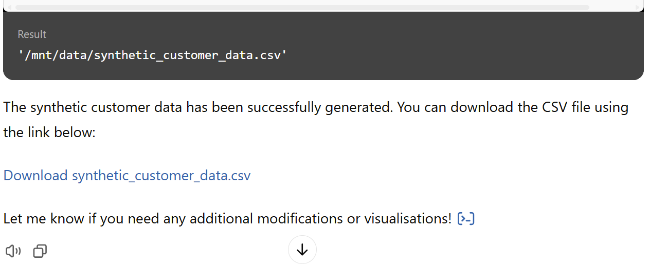
The final step is to execute the full process generating a nice download link for me to grab the file.
Loading into Power BI and Visualising
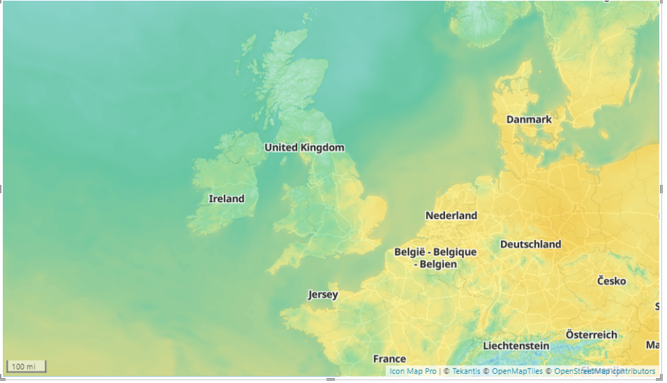
Once the data was generated, I loaded the CSV file directly into Power BI to visualise it. To my delight, it worked flawlessly on the first try! All 20,000 latitude and longitude points appeared perfectly within the bounding box of London, and the clusters were visibly centred in the areas I defined earlier, providing a realistic spread of customer data across different parts of the city.
Using Power BI's mapping capabilities, I could see the density of customers in the different clusters I had created, which mimicked the likely distribution of customer hotspots. This is an excellent way to simulate and test a customer analysis report without risking any sensitive information.
Conclusion and Next Steps
This is, of course, a very basic example, and we are somewhat limited to the Python libraries available within the standard ChatGPT environment. However, at Tekantis, we are working on a custom version of our Synthetic Data Generator that will offer far more extensibility, including additional libraries and more sophisticated data generation capabilities.
Stay tuned for future updates—exciting possibilities are on the horizon!
Final Write Up
Keeping to today's theme I also used the new "GTP-4o with canvas" tool to generate this blog!
If you'd like to see how the report was built, you can download it here.
You can also have a play with our Synthetic Data Generator here