30 Days of Maps Day 1 - Points

· 3 min read
James Dales
Co-founder of Tekantis

November 1st kicks off the 30-Day Map Challenge. Each day in November brings a new map visualisation challenge, and naturally, I'll be using Icon Map Pro in Power BI.

Throughout the month, I'll be showcasing the visual's capabilities, including both existing features and new ones we're about to release. We'd love for you to join in too—if you're interested, please get in touch at support@iconmappro.com, and we’ll send you a time-limited version of the visual for embedding on your blog—the same version I'll be using.

The theme for Day 1 is points - A map with points. Start the challenge with points. Show individual locations—anything from cities to trees or more abstract concepts. Simple, but a key part of the challenge.

Both built-in Power BI visuals can display circles or bubbles for point data, so I wanted to push the boundaries a bit and showcase something beyond what the standard visuals can do. Obviously I needed some point data, and I was keen to show something new that I haven't worked with before. I extracted the locations of every postbox in England from OpenStreetMap data. There are over 74,000 of them, which poses a challenge for Power BI, as its visuals are typically limited to 30,000 rows of data.

Icon Map Pro is capable of displaying up to 180,000 rows of data and we've been working hard on extending that in the latest releases, adding new performance improvements. In the forthcoming release it can comfortably display up to 360,000 circles (with labels and tooltips if required) and we hope to extend that further. Whilst we can now display all those points on the map at once, some might argue that it doesn't make sense to do so, which is why we're also working on improving our clustering. You still need to be able to include all the points, before you can cluster them - so even with clustering increasing the number of rows is essential.

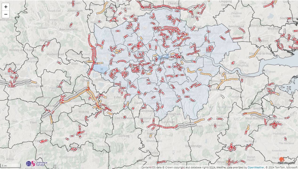
So let me walk you through the map below.

Background map - this is our built in 'Positron' style, which is normally light grey. However, I've changed the colour of the water to white and land background to pale green using a forthcoming Icon Map Pro capability.

Overlay - I've overlaid the local authority boundaries (downloaded from geoportal.statistics.gov.uk).

Points - Using QGIS, I geocoded each postbox location with its respective local authority area, allowing the report to filter locations with a Power BI slicer. Each postbox is represented by a red circle on the map. A tooltip shows the operator, collection times, and postcode of each postbox where this information is available. I’ve added two versions of the map, switchable with bookmarks accessed via the “Cluster” button. One version shows all 74,000 circles at every zoom level; the other clusters the postboxes, displaying the number within each area.

If you'd like to see how the report was built, you can download it here.

I'm already looking forward to tomorrow's challenge - lines.

Using Meteomatics

· One min read
James Dales
Co-founder of Tekantis

Meteomatics provide a weather API that can be used to overlay a wide range of weather layers onto your map as a WMS overlay.

Meteomatics Screenshot

To use Meteomatics, we need to use access token authentication.

Firstly, set the WMS Server URL as below: https://api.meteomatics.com/wms

Set the Authentication Type to “Token / API Key in URL” Set the Authentication Property Name to “access_token”

Then for the Authentication Property Value you need to get an access token from Meteomatics. Logging into this address will allow you to obtain a token: https://login.meteomatics.com/api/v1/token

Meteomatics uses WMS version 1.3.0 so we need to override Icon Map Pro to use this version:

Set Custom Parameter Name to “version” Set Custom Parameter Value to “1.3.0”

And finally enter the name of the metomatics layer into Layer. Eg “t_2m:C

Configuration

Icon Map Pro unlocks ArcGIS assets in Power BI

· 2 min read
James Dales
Co-founder of Tekantis

Esri are the market leader in GIS software and many of the companies we speak to have a large investment in ArcGIS with much of their geospatial data estate held within the platform.

Although Esri provide the ArcGIS visual for Power BI, its functionality is limited, making it challenging for organizations to integrate their geospatial assets effectively with other data within their data platform and Power BI.

We hope to change this with this week’s Icon Map Pro release in Microsoft AppSource. We’re releasing a huge range of ArcGIS features to help people surface their ArcGIS resources in Power BI.

alt text

Here are the headlines:

  • Choose between username & password, API Key or OAuth2 authentication. By opting for OAuth2 with a client ID and secret in the ArcGIS Location Platform, you eliminate the need for individual user logins or ArcGIS Viewer licenses.
  • Use ArcGIS background maps, or your organisation’s own custom maps.
  • Bring in ArcGIS feature layers and use Power BI conditional formatting to set the colours – enabling for example choropleth maps using your Power BI data.
  • Draw multiple reference layers and data-bound ArcGIS layers on the same map.
  • Drill-down between levels to show more detailed geographies.
  • Use Power BI native features such as Report Page Tooltips, Drill-Through, Cross-highlighting etc.
  • Use ArcGIS to host your GeoJSON files to use in Icon Map Pro.
  • Use ArcGIS vector tile layers.
  • Use ArcGIS WMS layers and apply dynamic filters.
  • Combine ArcGIS resources with other non-ArcGIS items.

And it’s not just ArcGIS features we’re releasing. Check out some of the other highlights:

  • Ability to specify authentication for WMS layers.
  • Improved process for uploading GeoJSON/KML/Shapefiles.
  • New weight field and custom colours in heatmaps.
  • Support for TopoJSON files alongside GeoJSON / KML and Esri Shapefiles.

This post just scratches the surface. Check out the Icon Map Pro documentation for the full details.

Oh and I can’t wait to share what’s coming next!

September Teaser

· 3 min read
James Dales
Co-founder of Tekantis

Screenshot of demo

I've spoken to a lot of companies over the last few weeks about the kind of things that they want to be visualising on a map in Power BI. A lot of the time, it boils down to wanting to show a lot of information on the map at the same time, overlaid with even more information. This is a challenge in Power BI as it's not geared up for visuals to be able to show a lot of granular information without it being aggregated first. Most Power BI visuals are limited to 30000 rows of data for example.

However, this is something that we want to enable - I like a challenge! Here's little teaser of a report I've built using an in-progress release of Icon Map Pro that will likely be available towards the end of September. It shows deprivation data as a choropleth map for the whole of England at Lower Super Output (LSOA) level from an uploaded shapefile, overlaid with care providers in blue. You can use the Power BI slicers to select a particular deprivation domain, or view the Index of Multiple Deprivation. For the care providers, you can view all of them, or select specific services. You can choose to view all of England at once, or select specific regions.

Going back to that challenge - well there are 32844 LSOAs in England and 53560 care providers.

I've made the report available via Publish to Web - try it out here. (Not optimised for mobile)

Whilst it's possible today to create this report with Icon Map Pro, it's not as straight forward as I would like, and requires some messy modelling. This report was pretty straight forward in comparison. It's all one visual - there are no bookmarks or hidden pages. The deprivation data is held within the shapefile as properties against each feature. We're enabling the ability to format these based on either text conditions, or create a colour gradient based on the values. The property to show can be set with Power BI conditional formatting so you can control it with a slicer:

Formatting Properties

This means that the shape file doesn't need to be bound to a Power BI dataset, which means it can contain a lot more than 30000 features. As we're not trying to match the features to the Power BI data either, it means the performance is better. And there's no messy modelling to combine it with other data shown on the map. The data model is quite simple, and really just contains the care provider information and a disconnected table to drive the deprivation indicator slicer:

Data Model

All this is laying the foundations for future capabilities we're building - this is all going to get even easier, and even more powerful.

Using OpenStreetMap's tile servers

· 3 min read
James Dales
Co-founder of Tekantis

I've just submitted an update to the old Icon Map visual in Microsoft AppSource, which should go live very soon. The primary objective was to fix a security vulnerability identified in one of the underlying open-source libraries. This update also includes a number of other bug fixes that have been made since the previous release, which was a number of years ago.

During the build process, a warning appeared that the current method of coding the formatting panel is about to be deprecated. I will no longer be able to use that code going forward. Therefore, this will be the final update to the old Icon Map visual, as updating to the newer API would require significant work.

Another noticeable change in this update is a more prominent warning about using OpenStreetMap (OSM) map backgrounds. While this is highlighted in the documentation and sample file, it is now also emphasised in the visual itself.

OpenStreetMap data can be used in free and commercial products, provided the appropriate attribution and copyright notices are maintained. You can find more details here: https://www.openstreetmap.org/copyright. As a long-term contributor to OpenStreetMap, this is something I'm particularly passionate about.

So, what’s the situation with using OpenStreetMap backgrounds in Icon Map? While the use of the data is permitted, the use of the OpenStreetMap Foundation's servers is not: "OpenStreetMap data is free for everyone to use. Our tile servers are not." (https://operations.osmfoundation.org/policies/tiles/).

The foundation's switch2OSM website is even more explicit: "Apart from very limited testing purposes, you should not use the tiles supplied by OpenStreetMap.org itself. OpenStreetMap is a volunteer-run non-profit body and cannot supply tiles for large-scale commercial use. Rather, you should use a third-party provider that makes tiles from OSM data, or generate your own." (https://switch2osm.org/using-tiles/)

It’s worth noting that other providers who offer free use of their services may stipulate specific requirements, such as use only for non-profit or public-facing sites.

This is why Icon Map provides the ability to use Mapbox tiles or a custom URL to configure a commercial provider or your own tile server. Please use the OpenStreetMap backgrounds only for testing purposes.

It’s also worth mentioning that other Power BI map visuals may not even adhere to the copyright, attribution, or usage policy, nor offer an alternative. At least four of the commercial Power BI map visuals provide OpenStreetMap layers hosted on the OSM servers. Some also offer backgrounds from other providers without providing the appropriate attribution, and some are not using the required API to access other commercial base map providers, possibly breaching those usage conditions.

This is a complex area, and it's something I wanted to address head-on when building Icon Map Pro. Icon Map Pro provides its own background map tile service, hosted by Tekantis, built using OpenStreetMap data and included within the visual's licence fee. As you can imagine, providing a map service with global coverage is no small undertaking, but it means that we are not dependent on using anyone else's servers for our maps.

Icon Map Pro also enables you, with the appropriate API key or credentials, to use other providers' background maps instead of the Tekantis hosted maps. This means that we also use the JavaScript APIs for Google Maps, Mapbox, Esri, and Maptiler where appropriate, to ensure that we comply with their licence terms, showing logos and attribution messages where required. This explains why you may see the Ordnance Survey, Google Maps, MapTiler, Mapbox, OpenWeatherMap etc logos overlaid on your maps.

General Election Results

· One min read
James Dales
Co-founder of Tekantis

As a UK based geospatial company, it seemed natural to want to visualise the UK general election results as they're being announced inside of Power BI using Icon Map Pro. I've created a quick Power BI report and made it available below to try out using Publish to Web.

For the the next day or so, the report will be refreshed every 5 minutes, and should show the latest results for each constituency. Where the results have not yet been announced, they will appear white on the map. Where they have been announced that constituency will be coloured using the main political parties' colours, or in grey for other parties and independent candidates.

Tooltip

Hovering over an area on the map will show the political parties of the candidates standing in that area as a Power BI report page tooltip. Where the result has been announced the winning party will be highlighted.

Postcode

If you enter a UK postcode in the box in the top left, the constituency that postcode is assigned to will be highlighted, and the location of that postcode will be highlighted as a point on the map.

Creating Legends

· 2 min read
James Dales
Co-founder of Tekantis

Whilst we have it on our backlog, Icon Map Pro doesn't yet have the ability to draw a legend. It's actually really complicated to create a legend that works for all of the different types of maps that you can create with the visual. Separating out the different formatting options should help with this, but it's still not an easy job.

The good news is, in the meantime, we can use Power BI's built in visuals to create really effective, interactive legends.

My favorite technique is to use Power BI's new slicer visual. The one with the lighting bolt:

Lightning Bolt Slicer

As the new slicer visual supports conditional formatting, we can apply the same color rules to the slicer as we can the shapes on the map.

In this case I'm using the accent bar within the button to show a square of color. I've increased the width of the bar and then set the color using using conditional formatting.

Accent bar

I've also set the padding so that the text appears further to the right to allow for the wider accent bar.

Padding

Other things to remember:

Turn on "Maintain layer order" on both the legend and map visual. This way the legend will always appear on top of the map once you've published it to the Power BI service.

Maintain layer order

And also turn off the header icons on the legend visual.

Header Icons

Download the example report to see how it's done.

Why Icon Map Pro?

· One min read
James Dales
Co-founder of Tekantis

More than six years ago I created Icon Map, a map visual for Power BI. This year I've set up a new company alongside Tekantis CTO, Brynn Borton, to launch Icon Map Pro. This blog explains what's behind this, and what is to become of the original Icon Map visual.