September Teaser

I've spoken to a lot of companies over the last few weeks about the kind of things that they want to be visualising on a map in Power BI. A lot of the time, it boils down to wanting to show a lot of information on the map at the same time, overlaid with even more information. This is a challenge in Power BI as it's not geared up for visuals to be able to show a lot of granular information without it being aggregated first. Most Power BI visuals are limited to 30000 rows of data for example.
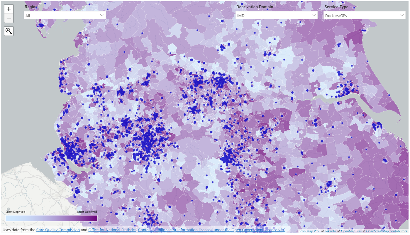
However, this is something that we want to enable - I like a challenge! Here's little teaser of a report I've built using an in-progress release of Icon Map Pro that will likely be available towards the end of September. It shows deprivation data as a choropleth map for the whole of England at Lower Super Output (LSOA) level from an uploaded shapefile, overlaid with care providers in blue. You can use the Power BI slicers to select a particular deprivation domain, or view the Index of Multiple Deprivation. For the care providers, you can view all of them, or select specific services. You can choose to view all of England at once, or select specific regions.
Going back to that challenge - well there are 32844 LSOAs in England and 53560 care providers.
I've made the report available via Publish to Web - try it out here. (Not optimised for mobile)
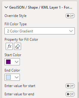
Whilst it's possible today to create this report with Icon Map Pro, it's not as straight forward as I would like, and requires some messy modelling. This report was pretty straight forward in comparison. It's all one visual - there are no bookmarks or hidden pages. The deprivation data is held within the shapefile as properties against each feature. We're enabling the ability to format these based on either text conditions, or create a colour gradient based on the values. The property to show can be set with Power BI conditional formatting so you can control it with a slicer:
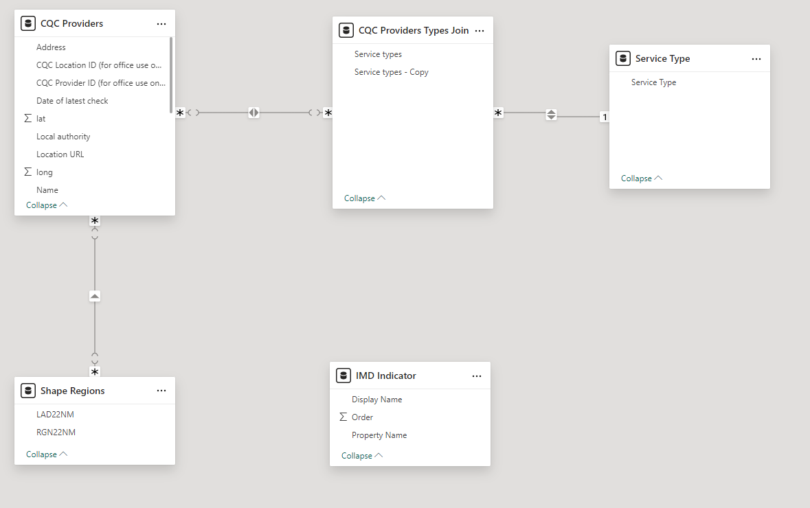
This means that the shape file doesn't need to be bound to a Power BI dataset, which means it can contain a lot more than 30000 features. As we're not trying to match the features to the Power BI data either, it means the performance is better. And there's no messy modelling to combine it with other data shown on the map. The data model is quite simple, and really just contains the care provider information and a disconnected table to drive the deprivation indicator slicer:
All this is laying the foundations for future capabilities we're building - this is all going to get even easier, and even more powerful.