30 posts tagged with "30DaysOfMaps"

View All Tags

30 Days of Maps Day 10 - Pen & Paper

· 2 min read
James Dales
Co-founder of Tekantis

We're onto day 10 of the #30DayMapChallenge and the theme is pen and paper - Draw a map by hand. Go analog and draw a map using pen and paper. The result doesn’t have to be perfect—it’s about the creative process.

Now this one is a real challenge as I'm no artist! As a child I loved reading the Swallows & Amazons series of books by Arthur Ransome. One of the things I loved about the books was they always contained a map showing where the different aspects of the story were set - whether in the real world, or fictional world - and sometimes somewhere in between.

Whilst the challenge is pen and paper, this doesn't mean we can't visualise the end result in Icon Map Pro and use all the same interactivity capabilities we would expect from a normal map...

I've taken inspiration from Swallows and Amazons and drawn a map of the fictional lake in the Lake District where some of the books were set. I've hand drawn it, scanned it in, and used it as a custom image background in Icon Map Pro. I then drew a small sailing dinghy, and used a online tool to convert it to a 64bit encoded data URL which I've added as a DAX measure into the Power BI report. I've then traced a path from one side of the lake to the other around some of the islands, and used the Play Axis custom visual to animate the journey of the boat across the lake. I've made a DAX measure to half-calculate the rotation angle of the boat to add to the effect.

If you'd like to see how the report was built, you can download it here.

30 Days of Maps Day 9 - AI Only

· 8 min read
Brynn Borton
Co-founder of Tekantis

We're onto day 9 of the #30DayMapChallenge.

The theme for today's map is AI Only - This day is all about prompt engineering. Use AI tools like DALL-E, MidJourney, Stable Diffusion, or ChatGPT with geospatial capabilities to create a map based on AI-generated content. The challenge is to get the right prompt and critically assess the output—how well does AI capture or distort the map's intent?

I thought I would explore a scenario where you're working in a development environment with sensitive customer data but need substantial dummy data to test your reports. Using real customer data can be fraught with legal and privacy issues, especially in industries like finance, healthcare, and retail. That's where synthetic data comes in handy. Luckily, at Tekantis, we're already actively exploring synthetic data generation using OpenAI as part of one of our sideline lab projects. We have developed a Synthetic Data Generator Custom GTP to help create realistic but fake datasets. I have leveraged this tool to generate synthetic customer data with geospatial attributes to test map visualisation in Power BI.

The Business Scenario

Imagine you work in a company that handles customer data for market analysis. You need to create visual reports, but you can't use actual customer data because of privacy policies. Instead, I generated a dataset of 20,000 synthetic customer records, including attributes like customer names, age, gender, occupations, phone numbers, and coordinates within London. To make the data more realistic, we clustered customers around specific areas of London, mimicking natural customer distributions.

The Result

So how did we do it?

The Synthetic Data Generator Custom GTP 

The Synthetic Data Generator Custom GTP is designed to act as a multi-step process, working with the user interactively. First, it clarifies each requirement before moving on to the next step, ensuring accuracy and alignment with user expectations. Then, it uses the code interpreter to generate and execute Python code in real-time.   Once the data is successfully generated, it provides a downloadable link for easy access to the resulting file.

The first step is for the AI and User to agree the plan, the GTP does most of the work here I simply prompted with the above scenario and after a couple of iterations the GTP had generated the following plan:

  1. Bounding Box over London: Use a simple square bounding box covering London to generate random latitude and longitude coordinates, simplifying the location generation process.

  2. Attributes to Include: Generate a dataset of 20,000 customer records with the following attributes:

    • Customer ID: Unique identifier for each customer.
    • Name: Generated using gender-specific names from Faker.
    • Gender: Evenly split between male, female, and a small percentage for other categories.
    • Age: Distributed between 18 and 80 years, with more concentration in the 25-55 range.
    • Occupation: Realistic job titles generated by Faker.
    • Income: Random annual income between £20,000 and £100,000.
    • Phone Number: UK-based phone numbers.
    • Latitude and Longitude: Randomly generated coordinates within London.
    • Life Time Value (LTV): A randomised total sales figure for each customer.
  3. Clustering Data: Create clusters of customer locations to simulate areas with higher customer density:

    • Defined five cluster centres across London: Central, North, East, West, and South.
    • 80% of data points will be clustered around these centres.
    • 20% will be uniformly distributed to simulate a spread-out population.
  4. Data Generation Process:

    • Generate clustered data points using normal distributions centred around each cluster centre.
    • Generate uniform data points to cover the remainder of London.
    • Generate demographic data (e.g., name, age, occupation) using the Faker library.
  5. Validation:

    • Ensure all latitude and longitude values fall within the bounding box.
    • Verify that gender-specific names align correctly.
    • Ensure age and income distributions are realistic.
  6. Output: Generate a CSV file with all attributes included and provide a download link for easy access.

The second step is to generate and run the Python code, this is the code it produced which actually worked first time.  However, even if it hadn't the beauty with the ChatGTP code interpreter is that it can identify and self-correct errors in the code, rerunning the script until it executes successfully:  

import random
import pandas as pd
from faker import Faker
import numpy as np

# Initialize Faker
fake = Faker('en_GB') # Use 'en_GB' locale for UK-specific data
Faker.seed(42)
random.seed(42)
np.random.seed(42)

# Parameters
num_records = 20000

# Define the bounding box over London (approximate coordinates)
min_lat, max_lat = 51.2868, 51.6919
min_lon, max_lon = -0.5103, 0.3340

# Cluster centers (latitude and longitude)
cluster_centers = [
(51.5074, -0.1278), # Central London
(51.5555, -0.0786), # North London
(51.4860, -0.0200), # East London
(51.5121, -0.3007), # West London
(51.4400, -0.0550), # South London
]

# Number of clusters and distribution of points
num_clusters = len(cluster_centers)
cluster_size = int(0.8 * num_records / num_clusters)
uniform_size = num_records - (cluster_size * num_clusters)

# Function to generate clustered points
def generate_clustered_points(center, num_points, cluster_std=0.02):
lat_center, lon_center = center
latitudes = np.random.normal(loc=lat_center, scale=cluster_std, size=num_points)
longitudes = np.random.normal(loc=lon_center, scale=cluster_std, size=num_points)
return latitudes, longitudes

# Generate clustered data
latitudes = []
longitudes = []
for center in cluster_centers:
lat, lon = generate_clustered_points(center, cluster_size)
latitudes.extend(lat)
longitudes.extend(lon)

# Generate uniformly distributed data
uniform_latitudes = np.random.uniform(min_lat, max_lat, uniform_size)
uniform_longitudes = np.random.uniform(min_lon, max_lon, uniform_size)
latitudes.extend(uniform_latitudes)
longitudes.extend(uniform_longitudes)

# Truncate or extend lists to match num_records
latitudes = latitudes[:num_records]
longitudes = longitudes[:num_records]

# Generate demographic data
genders = np.random.choice(['Male', 'Female', 'Other'], size=num_records, p=[0.49, 0.49, 0.02])

names = []
ages = []
occupations = []
incomes = []
phone_numbers = []
customer_ids = []
lifetime_values = []

for i in range(num_records):
gender = genders[i]
if gender == 'Male':
name = fake.name_male()
elif gender == 'Female':
name = fake.name_female()
else:
name = fake.name_nonbinary()
names.append(name)

# Age distribution (more customers in the 25-55 age range)
age = int(np.random.normal(loc=40, scale=12))
age = max(18, min(age, 80)) # Clamp age between 18 and 80
ages.append(age)

# Occupation
occupation = fake.job()
occupations.append(occupation)

# Income level based on age (simplified assumption)
income = random.randint(20000, 100000)
incomes.append(income)

# Phone number
phone_number = fake.phone_number()
phone_numbers.append(phone_number)

# Customer ID
customer_id = fake.unique.uuid4()
customer_ids.append(customer_id)

# Life Time Value
lifetime_value = round(random.uniform(500, 50000), 2)
lifetime_values.append(lifetime_value)

# Create the DataFrame
data = {
'CustomerID': customer_ids,
'Name': names,
'Gender': genders,
'Age': ages,
'Occupation': occupations,
'Income': incomes,
'PhoneNumber': phone_numbers,
'Latitude': latitudes,
'Longitude': longitudes,
'LifeTimeValue': lifetime_values
}

df = pd.DataFrame(data)

# Save to CSV
file_path = 'synthetic_customer_data_with_ltv.csv'
df.to_csv(file_path, index=False)

The GTP also provided a nice sample of the Resulting Dataset before asking if we want to execute the whole process. You can see here that using Faker it has generated realistic name, phone numbers, occupations etc.

CustomerIDNameGenderAgeOccupationIncomePhoneNumberLatitudeLongitudeLifeTimeValue
6f9c5f25-4e88-4e28-b2c5-9fca56642d4cStephen ArnoldMale36Producer, radio83265020 2012 266051.5179-0.114735264.12
b04a0f2b-4912-4863-855e-dcc1127b48fbSusan GibsonFemale38Pensions consultant70749020 0908 986451.5186-0.132612634.56
0ef57f34-1062-44a8-95cf-d8c3c976dc0eEwan HurstMale49Psychologist, educational24137016977 292451.5255-0.11628849.73

The final step is to execute the full process generating a nice download link for me to grab the file.   
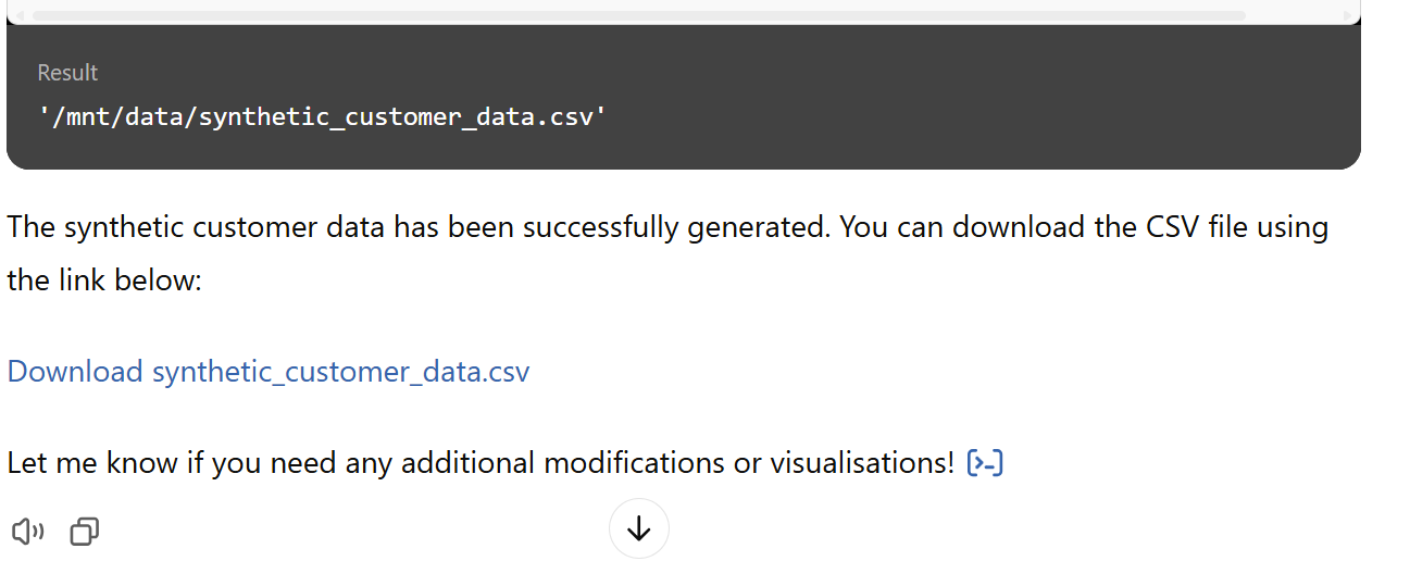
Final Output

Loading into Power BI and Visualising

Once the data was generated, I loaded the CSV file directly into Power BI to visualise it. To my delight, it worked flawlessly on the first try! All 20,000 latitude and longitude points appeared perfectly within the bounding box of London, and the clusters were visibly centred in the areas I defined earlier, providing a realistic spread of customer data across different parts of the city.

Using Power BI's mapping capabilities, I could see the density of customers in the different clusters I had created, which mimicked the likely distribution of customer hotspots. This is an excellent way to simulate and test a customer analysis report without risking any sensitive information.

Conclusion and Next Steps

This is, of course, a very basic example, and we are somewhat limited to the Python libraries available within the standard ChatGPT environment. However, at Tekantis, we are working on a custom version of our Synthetic Data Generator that will offer far more extensibility, including additional libraries and more sophisticated data generation capabilities.

Stay tuned for future updates—exciting possibilities are on the horizon!

Final Write Up

Keeping to today's theme I also used the new "GTP-4o with canvas" tool to generate this blog!

If you'd like to see how the report was built, you can download it here.

You can also have a play with our Synthetic Data Generator here

30 Days of Maps Day 8 - Humanitarian Data Exchange (HDX)

· 2 min read
James Dales
Co-founder of Tekantis

We're onto day 8 of the #30DayMapChallenge.

The theme for today's map is Humanitarian Data Exchange (HDX) - *Use data from HDX to map humanitarian topics. Explore the datasets from the Humanitarian Data Exchange, covering disaster response, health, population, and development. Map for social good. *

The dataset caught my eye as it's vast! I'm using the Global Population Density for 400m H3 Hexagons dataset from Kontur. I then limited to the Central American countries which is still 286,422 rows of data. As we've seen from previous challenges, more than 30,000 rows is a challenge for Power BI. I've used a forthcoming version of Icon Map Pro that will enable more H3 hexagons to be displayed on the map - in this case nearly 300,000.

The earlier challenge where I used H3 hexagons, Icon Map Pro generated the H3 cells based on aggregating longitude and latitude coordinates, whereas in this case, the data is provided as 2 columns - H3 Cell Index and Population in that cell. Icon Map Pro natively supports these cell IDs so the map configuration is really easy and only requires these 2 fields. I also overlaid a shape file with the country outlines in too, and added a Power BI slicer to zoom to specific countries.

If you'd like to see how the report was built, you can download it here.

30 Days of Maps Day 7 - Vintage style

· 2 min read
James Dales
Co-founder of Tekantis

Today is day 7 of the #30DayMapChallenge.

The theme for today's map is Vintage style - Map something modern in a vintage aesthetic. Create a map that captures the look and feel of historical cartography but focuses on a contemporary topic. Use muted colors, fonts, and classic elements.

There were a number of ways I considered tackling this challenge. The first was to head over to Mapbox Studio as Icon Map Pro supports Mapbox Studio styles. However, I thought it would be good to see what I could achieve without relying on third-party integrations. So instead I've achieved the vintage style by firstly placing an image of a canvas as the background for my Power BI report. I generated this using Chat GPT. I then added Icon Map Pro to the report and set the visual background to Off. This doesn't immediately have any effect, but in the background map options, you can change the transparency. So I chose our monochrome "Toner (no labels)" style and set its transparency to around 70 percent. That means that the normally white areas of the map show the map canvas, and the black water and infrastructure areas are shown in a dark brown. I feel this gives a nice vintage appearance.

Then on top of this I added a feature layer of listed buildings from Historic England's Open Data Hub. This is loaded directly from their servers using our ArcGIS integration and displayed in a transparent blue colour, so you still get some of the canvas effect. Then finally I applied tooltips - data sourced directly out of the ArcGIS layer to show the name of the building. I chose a serif style font, and set the transparency of the tooltip so the canvas shows through a little.

Finally I added the London Boroughs as a shape layer, so it's possible to zoom into a specific London Borough using a Power BI slicer - which again through transparency options on the shape layer is highlighted on the map.

If you'd like to see how the report was built, you can download it here.

30 Days of Maps Day 6 - Raster

· One min read
James Dales
Co-founder of Tekantis

Today is day 6 of the #30DayMapChallenge.

The theme for today's map is raster - A map using raster data. Rasters are everywhere, but today’s focus is purely on grids and pixels—satellite imagery, heatmaps, or any continuous surface data.

Whilst most data displayed on the map in Power BI is going to be point or vector data bound to the Power BI data model, it is often useful to add additional reference information in the form of raster data. Icon Map Pro supports a number of sources of raster data including XYZ tiles and WMS layers.

In this report we've overlaid data from the British Geological Survey (BGS) on top of the base map. The Power BI slicer in the top right corner allows you to select from a number of different layers detailing the makeup of the UK's bedrock. To add some additional information, we've overlaid a GeoJSON layer showing the locations of all the UK's quarries.

If you'd like to see how the report was built, you can download it here.

30 Days of Maps Day 5 - A journey

· 2 min read
James Dales
Co-founder of Tekantis

Today is day 5 of the #30DayMapChallenge.

The theme for today's map is a journey - Map any journey. Personal or not. Trace a journey—this could be a daily commute, a long-distance trip, or something from history. The key is to map movement from one place to another.

The data for today's map comes from aircraft flying above my house. I capture the transponder transmissions using a Raspberry PI with an antenna and push these into Microsoft Fabric's Realtime Intelligence workload. I've included a morning's worth of captured data from November 1st, and animated it using the Play Axis custom visual.

The data captured includes the longitude and latitude information for each aircraft - these are stored on a separate row in the dataset. I then use the CONCATENATEX function in DAX to generate a Well-Known Text (WKT) linestring. Using the aircraft's unique ID as the ID field in Icon Map Pro, and then the DAX measure, it create a WKT linestring for each aircraft. I'm showing the last 10 minutes worth of history for each aircraft - so you'll see planes not moving for a while after I stop detecting data for them. At the end of each linestring, I'm displaying an SVG image of an aircraft - different images for each category of plane. These images are rotated within Icon Map Pro to point in the direction of travel.

If you'd like to see how the report was built, you can download it here.

30 Days of Maps Day 4 - Hexagons

· 2 min read
James Dales
Co-founder of Tekantis

Today is day 4 of the #30DayMapChallenge.

The theme for today's map is hexagons - Maps using hexagonal grids. Step away from square grids and try mapping with hexagons. A fun way to show density or spatial patterns..

Given our logo, this challenge could have been made for us! Icon Map Pro has the in-built capability to index point data (longitudes and latitudes) into Uber's H3 hexagon grid system - as well as providing support for data already indexed. For this challenge we're going to use open data from data.police.uk and examine every crime committed in England in September 2024. It turns out there were over 435,000 crimes committed in England in September that had their location recorded. In fact there were nearly different 200,000 locations in the dataset.

This report is sending all 435,000 crimes into the map to be converted into hexagons - well beyond the data limits for the "out of the box" visuals. The report allows you to select the resolution for these hexagons using a Power BI slicer. Pick a higher number for smaller hexagons when zooming in an looking at a smaller area. The hexagon cells are coloured according to how many crimes were recorded within that area - from white being the lowest through blue to red being the highest (with more time available I'd have added a legend). Two Power BI bar charts allow you to filter the map by type of crime and region, and a slicer is provided to drill into specific Local Authorities. You can also click on a cell to see the breakdown of crimes within each cell.

If you'd like to see how the report was built, you can download it here.

Includes data from data.police.uk and ONS GeoPortal. All the data on this site is made available under the Open Government Licence v3.0.

30 Days of Maps Day 3 - Polygons

· 2 min read
James Dales
Co-founder of Tekantis

Any now we're moving along to day 3 of the #30DayMapChallenge.

The theme for today's map is polygons - A map with polygons. Regions, countries, lakes—this day is for defined shapes that fill space..

Whilst Icon Map Pro has a wide range of options for displaying polygons - the most popular and fastest way is to upload a file into the report, whether it's Esri Shapefile, KML, GeoJSON or TopoJSON. However, the downside of this, is that it increases the size of the report, and for really large files, this approach won't work. For example in today's challenge, I'm using the National Forest Inventory from the Forestry Commission's Open Data site. This dataset is downloadable as an Esri Shapefile, but it's nearly 2gb in size containing more than 650,000 polygons. For large and complex datasets such as these, we need a different approach. I've decided to use vector tiles, to break up the shape file into a grid in which each square is downloaded only when required. I'm hosting my tile layer in my GeoServer, although Mapbox would also have been another easy option.

The vector tiles are then matched to my Power BI dataset on the fly, and coloured using Power BI's conditional formatting. This also means that the shapes are interactive - I can add tooltips, select them to interact with other report elements - in my case a table.

I've also included a Local Authority slicer so you can view a the woodland within a specific Local Authority area. I've added a reference layer to show the Local Authority boundaries - this is filtered by conditional formatting in Icon Map Pro to just show the boundary for the Local Authority we've filtered to.

If you'd like to see how the report was built, you can download it here.

30 Days of Maps Day 2 - Lines

· One min read
James Dales
Co-founder of Tekantis

2nd of November brings us to the 2nd Day of the #30DayMapChallenge.

The theme for today's map is lines - A map with focus on lines. Roads, rivers, routes, or borders—this day is all about mapping connections and divisions. Another traditional way to keep things moving.

Icon Map Pro can do a lot with lines, whether simple lines between two points, or complex linestrings. However, for this challenge I thought I'd keep things simple, and use a dataset that's an old favourite of mine - airline flight routes from OpenFlights.org. The Power BI report allows you to select an airline, and optionally source or destination country, cities or airports, and draws all of the routes that that airline flies. As a little touch, I included nautical miles in the scale.

If you'd like to see how the report was built, you can download it here.

30 Days of Maps Day 1 - Points

· 3 min read
James Dales
Co-founder of Tekantis

November 1st kicks off the 30-Day Map Challenge. Each day in November brings a new map visualisation challenge, and naturally, I'll be using Icon Map Pro in Power BI.

Throughout the month, I'll be showcasing the visual's capabilities, including both existing features and new ones we're about to release. We'd love for you to join in too—if you're interested, please get in touch at support@iconmappro.com, and we’ll send you a time-limited version of the visual for embedding on your blog—the same version I'll be using.

The theme for Day 1 is points - A map with points. Start the challenge with points. Show individual locations—anything from cities to trees or more abstract concepts. Simple, but a key part of the challenge.

Both built-in Power BI visuals can display circles or bubbles for point data, so I wanted to push the boundaries a bit and showcase something beyond what the standard visuals can do. Obviously I needed some point data, and I was keen to show something new that I haven't worked with before. I extracted the locations of every postbox in England from OpenStreetMap data. There are over 74,000 of them, which poses a challenge for Power BI, as its visuals are typically limited to 30,000 rows of data.

Icon Map Pro is capable of displaying up to 180,000 rows of data and we've been working hard on extending that in the latest releases, adding new performance improvements. In the forthcoming release it can comfortably display up to 360,000 circles (with labels and tooltips if required) and we hope to extend that further. Whilst we can now display all those points on the map at once, some might argue that it doesn't make sense to do so, which is why we're also working on improving our clustering. You still need to be able to include all the points, before you can cluster them - so even with clustering increasing the number of rows is essential.

So let me walk you through the map below.

Background map - this is our built in 'Positron' style, which is normally light grey. However, I've changed the colour of the water to white and land background to pale green using a forthcoming Icon Map Pro capability.

Overlay - I've overlaid the local authority boundaries (downloaded from geoportal.statistics.gov.uk).

Points - Using QGIS, I geocoded each postbox location with its respective local authority area, allowing the report to filter locations with a Power BI slicer. Each postbox is represented by a red circle on the map. A tooltip shows the operator, collection times, and postcode of each postbox where this information is available. I’ve added two versions of the map, switchable with bookmarks accessed via the “Cluster” button. One version shows all 74,000 circles at every zoom level; the other clusters the postboxes, displaying the number within each area.

If you'd like to see how the report was built, you can download it here.

I'm already looking forward to tomorrow's challenge - lines.