30 posts tagged with "30DaysOfMaps"

View All Tags

30 Days of Maps Day 20 - OpenStreetMap

· 2 min read
James Dales
Co-founder of Tekantis

It's day 20 of the #30DayMapChallenge and today's theme is OpenStreetMap - Use OpenStreetMap data to create something. OpenStreetMap offers rich, editable data from roads to buildings and beyond. The goal is to showcase the power of this community-driven dataset.

OpenStreetMap is a great source of geospatial information - in fact it's the data source from which we build our base maps. For today's challenge I've extracted the railway network for Europe. I've used the relations information to determine the routes for many of Europe's train operators. There's far too much data to load into a shape file, and too many operators to split into multiple files, so I've loaded the data as WKT into the Power BI dataset. Each section of track and station is a row of data - there are over 3 million of them.

I've added some Power BI conditional formatting, configured by slicers, to allow the track width to be represent the maximum speed of that section of track, and for the colour to represent a route by that operator. Selecting a specific route, will also enable labels to show the station names.

The stations I've mocked up a performance KPI, so stations are shown in traffic light colours according to their status. I've also added some random alerts, so you may see some warning triangles at various locations.

As OpenStreetMap data is crowd-sourced, the data quality isn't always consistent, so I've filtered the report to selected of train operators that have largely complete data.

If you'd like to see how the report was built, you can download it here.

30 Days of Maps Day 19 - Typography

· 2 min read
James Dales
Co-founder of Tekantis

It's day 19 of the #30DayMapChallenge and today's theme is Typography - Map focused on typography. Let text and words do the heavy lifting today. Whether you’re focusing on place names, labeling, or using text to create shapes and patterns.

Icon Map Pro's background layers include labels for places and streets etc as you would expect, but it also enables you to add data-bound text labels to the map.

Labels can be added onto the map and the text specified using conditional formatting, so it could be the name of an item on the map, or the value of a KPI or both! But it's not just the text itself that you can format using Power BI's conditional formatting. You can determine whether the label appears over, above, below, to the left or right of your circle or image. And of course you can set the colours, but not just of the text, but also the background and the border. And you can set the border width and amount the corners are rounded. And all this independently for every row of data. Perfect for making those KPIs stand out when they require attention, or just to add subtle context to the items on your map.

For lines, in addition to labels, we can also add text along the path of the line itself. You can specify the text, whether it appears above, below or through the line, whether it repeats along the path, or is just shown once. You can even chose whether it appears lengthways, or perpendicular to the line. And, of course, you can set the colour. All via conditional formatting.

If you'd like to see how the report was built, you can download it here.
30 Days of Maps Day 18 - 3D

· One min read
James Dales
Co-founder of Tekantis

Today is day 18 of the #30DayMapChallenge and today's theme is 3D - Map with depth. Add a third dimension to your map. Whether it’s visualizing elevation, buildings, or something more abstract, today’s about thinking beyond flat surfaces.

Icon Map Pro doesn't yet support 3D, but it is something we're planning and already prototyping.

Here's the Grasmere in the Lake District in the UK - I'm using our own base map layer with MapTiler's terrain RGB tiles to provide the elevation profile, giving the map it's 3D effect. Over that I've added a transparent layer showing the potential impact of flooding using the Environment Agency's WMS service. I've then extruded the building profiles from our base layer to highlight the potential impact of flooding on specific properties.

30 Days of Maps Day 17 - Collaborative Map

· 2 min read
James Dales
Co-founder of Tekantis

Sunday's challenge is day 17 of the #30DayMapChallenge and today's theme is Collaborative Map - Collaborate with others on a single map. For today’s challenge, team up! Whether you work with one person or several, the idea is to combine your efforts on a single map.

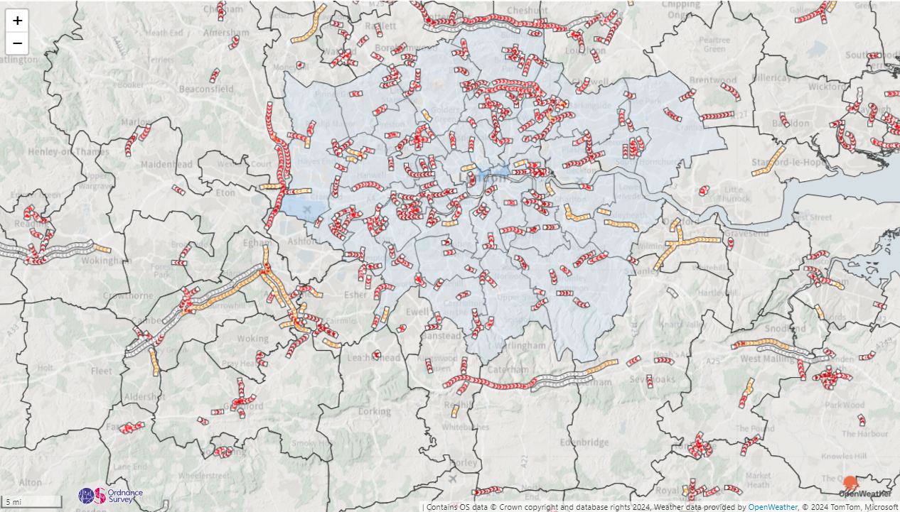
Sadly there hasn't been time to work on a map with someone else this week - there's just too much going on! However, I thought I would add a twist to the challenge instead, and show how lots of different providers can play together in Icon Map Pro.

This map has multiple providers contributing to the final map:

  • Background maps from Ordnance Survey
  • Hill shading overlaid from MapTiler
  • Local Authority Choropleth map using Mapbox hosted vector tiles
  • Lower Super Output Area boundary overlays via an ArcGIS feature layer hosted by the Office for National Statistics
  • Traffic provided by Azure Maps
  • Weather provided OpenWeatherMap

Clearly this isn't what you would build for a production map, but it's a good example of the different integrations that Icon Map Pro offers out of the box. Another one I couldn't quite squeeze in was Google Maps!

Collaborative Map

I can't provide the download link for today's challenge as it is dependant on too many external API keys that can't be shared.

30 Days of Maps Day 16 - Choropleth

· 3 min read
James Dales
Co-founder of Tekantis

Saturday brings us to day 16 of the #30DayMapChallenge and today's theme is "Choropleth" - Classic choropleth map. Use color to show data variation across regions. This simple but effective technique is a staple for showing thematic differences.

Choropleth maps have been one of the main uses of Icon Map Pro and I've already created a drill-down choropleth map on day 12 so I'm adding something extra to today's challenge. Often choropleth maps are used as context for other information shown on a map. In today's example I'm using the Index of Multiple Deprivation for England as context to show whether doctors surgeries and dentists are located in deprived areas. These are two separate datasets using different geography - the doctors and dentists are point data identified by longitude and latitude coordinates, and the deprivation data is at Lower Super Output Area (LSOA) level. There 33,755 LSOAs in England, so it's not possible to create an interactive choropleth map for England using Power BI's native visuals.

Two separate datasets in one visual are also a challenge for Power BI - the underlying architecture doesn't allow a single visual to be fed by more than one set of related tables. We can get around this by creating complex many to many relationships to ensure that filtering etc works as required, but it is not easy to get right. Icon Map Pro offers an additional approach with its reference layers, allowing the context information to be stored within the shape layer, and then the point data simply fed into the visual as a data layer. The great part is we can still conditionally format and filter the reference layer in line with the point data, even though it's not a normal data bound layer.

I've download the LSOAs for england from the Office for National Statistic's Geoportal, and joined it to the Index of Multiple Deprivation data using QGIS. For each LSOA, I've added a property to hold the deprivation index for each of the deprivation domains. I've then uploaded this file as an Esri Shapefile into Icon Map Pro. I can then specify gradient (or rule based) formatting within Icon Map Pro to colour the LSOAs based on the deprivation value. Which property to lookup up this value can also be set using Power BI conditional formatting, which I've driven from a Power BI slicer, to allow you to pick which deprivation domain to view. In addition I'm also dynamically filtering the LSOAs based on a region slicer, which also filters the doctors & dentists data.

The doctors and dentists data comes from the Care Quality Commission's Open Data Portal. I've then used PowerQuery to join the postcode from the CQC data to the National Statistics Postcode Lookup to get the longitude and latitude for each provider. I've limited to providers to just doctors and dentists for the challenge, but there's still 20 thousand of them. This is also the first public outing of Icon Map Pro's forthcoming clustering capability (a highly requested feature). Finally I've added tooltips to show the provider's name, services and specialisms.

The downside to this is needing to do a spatial join to add the deprivation data to the shape file - but we will be creating tooling to make this an easy process soon.

If you'd like to see how the report was built, you can download it here.

30 Days of Maps Day 15 - My data

· 2 min read
James Dales
Co-founder of Tekantis

Half way there! Day 15 of the #30DayMapChallenge and today's theme is "My data" - Map something personal. Map data from your own life—this could be places you’ve traveled, your daily routine, or any other personal touch.

For this challenge I needed some personal data so I requested an extract of all my data from Strava. Whilst I used to be a keen mountain biker, most of my recent activity has been riding with the kids, but there are still plenty of rides that I've recorded. The data extract from Strava contains a folder of all my rides in GPX format - one file for each ride, so I used PowerQuery's folder data source and merged all of my rides into a single table inside of Power BI - one row for each point along each ride. Within a couple of minutes I had a table of data with nearly a million rows of data. I really can't stress enough how quick this was!

I applied my usual DAX pattern that uses a measure to concatenate each point and turns them into a single linestring in WKT format - one of each ride. Adding this into Icon Map Pro meant I was able to visualise all of my rides ever in Power BI. I added a table at the bottom pulling out a few extra bits of meta data, and I was quickly able to zoom in and view each ride. Finally I added a line chart to show the elevation of each ride, using a DAX measure to only show the line when a single ride is selected.

Within less than 10 minutes I'd created an interactive report allowing me to analyse nearly a million data points. With more time there's loads more that could be done with this to add real value, calculating speed and average stats by year, month etc.

For privacy, I've restricted to the report to just a few rides in Wales, but it's enough to get the idea.

If you'd like to see how the report was built, you can download it here.

30 Days of Maps Day 14 - A world map

· One min read
James Dales
Co-founder of Tekantis

Day 14 of the #30DayMapChallenge and today's theme is a world map - Map the whole world. Whether it’s continents, ecosystems, or oceans, this is the day to map the entire planet.

Just a simple map today, but it shows one of my favourite overlay features - the realtime daylight terminator. This curve shows where it's nighttime or daytime right now - if you zoom in far enough you can see it moving across the map. If you have time sensitive data, you can add a datetime field to Icon Map Pro and it will show the curve at that date and time.

If you'd like to see how the report was built, you can download it here.

30 Days of Maps Day 13 - A new tool

· 2 min read
James Dales
Co-founder of Tekantis

Day 13 of the #30DayMapChallenge and today's theme is a new tool - Use a tool you’ve never tried before. The challenge has always been about trying new things. Use a tool, software, or drawing technique you’ve never worked with before.

At Tekantis, our focus so far has been on the geospatial visualisation capabilities of Power BI and Microsoft Fabric, but we're getting an increasing number of requests to features that aren't possible to provide purely in the visualisation layer. We've therefore been exploring how to provide some of these more advanced capabilities such as routing and travel times.

As an option I've set up OpenRouteService locally to experiment to see whether it could be an option for providing some of our capabilities. Here's a simple report as a result of some initial testing. The lines in the report represent the fastest driving routes between Heathrow Airport and London City Airport, either as a car or a HGV. I've also included a travel time isochrone representing how far you can drive in an HGV from London City Airport, in 5 minute increments.

If you'd like to see how the report was built, you can download it here.

30 Days of Maps Day 12 - Time and Space

· 3 min read
James Dales
Co-founder of Tekantis

Moving onto day 12 of the #30DayMapChallenge and today's theme is Time and Space - Map something where time matters. Visualize change over time—urban growth, migration, or environmental shifts. Show the relationship between time and geography.

I kind of covered this topic yesterday, showing the ice cap change over time, so I thought I'd pick something that I've had to deal with in customer projects. Boundary changes add a level of complexity to a reporting project, even when there isn't a map. This is a topic that especially impacts public sector organisations. When Local Authorities or Police Forces merge, or when census areas change it creates complexities for comparing data over time. In today's challenge I've attempted to address this. I've brought in crime data from data.police.uk for all of England for the last few years. This covers every police service, for every month. It's about a 4gb dataset before we even start thinking about shapes etc.

I'm mapping the crime data as a choropleth map at Local Authority level, but from here you can drill down to Lower Super Output Area level, and then down to street level as circles. The complexity comes as between 2022 and 2023 there were a number of Local Authority merges in Cumbria, Yorkshire and Somerset. The LSOAs in 2023 aggregate up into different or new Local Authorities.

Firstly in the map, we handle the changes by showing the appropriate shapes for the local authorities according to the date selected in the slicer, and also have separate lookup data between LSOA and local authority for each year. This means the right shapes are showing based on the date, and allows drill-down to continue functioning.

To show some different techniques, I've added the local authority shapes as WKT in the Power BI dataset - this is the easiest method of handling filtering based on date. Then the for the LSOA level, these are all based on 2021 boundaries, so I've used an Esri Shapefile uploaded into the report, and then for the circle layer, I'm using Longitude and Latitude coordinates, and the number of crimes at that location to size the circle. I've also added a filtered reference layer which only shows when circles are showing, to show the boundary of the LSOA we've drilled into.

If you'd like to see how the report was built, you can download it here.

30 Days of Maps Day 11 - Arctic

· 2 min read
James Dales
Co-founder of Tekantis

It's already day 11 of the #30DayMapChallenge and today's theme is the Arctic - Map the Arctic. Whether it’s ice coverage, wildlife habitats, or the effects of climate change, this day is all about mapping the cold extremes of the Arctic..

So mapping the Arctic in Icon Map Pro is a challenge as the Mercator projector excludes the Arctic. I've decided to use the Wiechel projection as it's a top down view of the North Pole. There's a lot of distortion as you move further away from the centre, but as we're focussed on the Pole, it works well.

I'm mapping the extent of the Polar Ice Cap using data from the National Snow and Ice Data Center. I've included the last 10 years of data showing the extent of the ice in December each year - you can drag the slicer show the different years. In addition I've overlaid the Arctic sea routes from the National Geospatial Intelligence Agency.

To draw the Wiechel projection, I've used the same technique as I did for the US Elections using the Albers USA projection, except this time I discovered the Dirty Reprojectors online app which allows you to upload a GeoJSON file in the WGS84 projection and it maps the coordinates to your selected projection - but using the WGS84 coordinate system. This means that the features appear centered in the middle of the map - not in their correct locations, so you can't use a background map. Instead of the background map, I'm using a geoJSON overlay of the countries - in the Wiechel projection.

If you'd like to see how the report was built, you can download it here.