
2 posts tagged with "hints and tips"

View All Tags

General Election Results

· One min read
James Dales
Co-founder of Tekantis

As a UK based geospatial company, it seemed natural to want to visualise the UK general election results as they're being announced inside of Power BI using Icon Map Pro. I've created a quick Power BI report and made it available below to try out using Publish to Web.

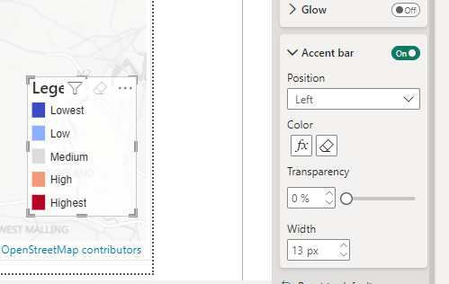
For the the next day or so, the report will be refreshed every 5 minutes, and should show the latest results for each constituency. Where the results have not yet been announced, they will appear white on the map. Where they have been announced that constituency will be coloured using the main political parties' colours, or in grey for other parties and independent candidates.

Tooltip

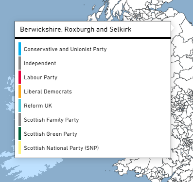
Hovering over an area on the map will show the political parties of the candidates standing in that area as a Power BI report page tooltip. Where the result has been announced the winning party will be highlighted.

Postcode

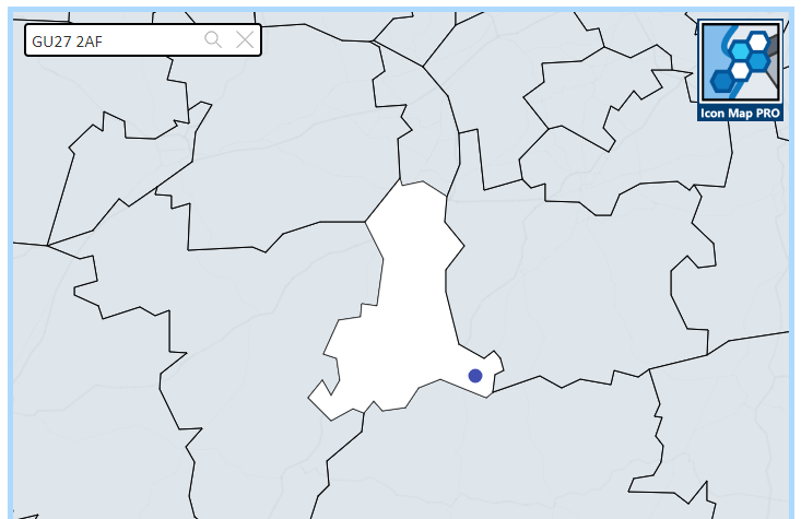
If you enter a UK postcode in the box in the top left, the constituency that postcode is assigned to will be highlighted, and the location of that postcode will be highlighted as a point on the map.

Creating Legends

· 2 min read
James Dales
Co-founder of Tekantis

Whilst we have it on our backlog, Icon Map Pro doesn't yet have the ability to draw a legend. It's actually really complicated to create a legend that works for all of the different types of maps that you can create with the visual. Separating out the different formatting options should help with this, but it's still not an easy job.

The good news is, in the meantime, we can use Power BI's built in visuals to create really effective, interactive legends.

My favorite technique is to use Power BI's new slicer visual. The one with the lighting bolt:

Lightning Bolt Slicer

As the new slicer visual supports conditional formatting, we can apply the same color rules to the slicer as we can the shapes on the map.

In this case I'm using the accent bar within the button to show a square of color. I've increased the width of the bar and then set the color using using conditional formatting.

Accent bar

I've also set the padding so that the text appears further to the right to allow for the wider accent bar.

Padding

Other things to remember:

Turn on "Maintain layer order" on both the legend and map visual. This way the legend will always appear on top of the map once you've published it to the Power BI service.

Maintain layer order

And also turn off the header icons on the legend visual.

Header Icons

Download the example report to see how it's done.